Introduction to PET headcurves
PET headcurves and water activation
This page introduces some theory and practice to do with the headcurve in PET activation studies.
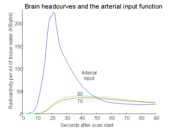
The headcurve, although appearing innocent and irrelevant on the PET scan console, provides some key clues to the best timing for your task during the PET scan. In order to understand why this is, we need some plots of the changes in radioactivity in the blood and brain during a typical water activation scan. And here they are:

The blue curve (with the tallest peak) is the radioactivity concentration in the radial artery after a typical bolus injection of radiolabelled water. The bolus injection started 35 seconds before the scan, but has taken about 40 seconds to get from the plastic tubing to the vein and hence to the artery. The graph covers the time period of the 90 second PET scan. Thus the x axis is time after scan start, and also [(time after bolus start) - 35 seconds].
The radioactivity in the artery increases dramatically at the 8 second mark (after the scan start), very soon after radioactivity in the venous blood mixes with the blood pool in the heart. The blood activity then declines for two reasons. The major cause for decline is efflux of radioactivity into the body tissues. The radioactivity also decays, with a 2 minute half-life, which is a much slower process.
The green curve (labeled 80) is the estimated plot of activity in area of gray matter with a high blood flow (80 mls/100mls of brain/min). This could be an activated brain region. Note that this gains radioactivity from the blood quite quickly when the arterial curve is high, but lags considerably behind the arterial concentration. The amount of lag is dependent on the blood flow. If blood flow is very high (volume of blood passing through per volume of tissue) then the blood radioactivity has a better chance to equilibrate with the brain. When the arterial concentration drops quickly due to diffusion into tissues other than the brain, the brain region again lags behind, and therefore has a higher concentration than the artery.
The red curve (labeled 70) represents a brain region with average flow for gray matter (70 ml/100mls/min). Note its slightly slower rise, and fall.
Of course the headcurve (total counts from the brain over time) will look very similar to the plots from these two brain areas, as it represents a plot of the total (and therefore average) activity from the brain. If we can see what is happening to the headcurve, we can infer the timing of the drop in arterial concentration. This is important, because changes in blood flow in the brain will have opposite effects early compared to late in the excursion of the arterial curve.
The activation PET scan gives us a measure of the areas under these tissue concentration curves, over the 90 second scanning window. Because we want to detect differences between high and low flow areas, we wish to maximize the difference between these curves for activated and not activated areas. The rate of change of the tissue concentrations will determine the areas under the curves. What dictates the rate of change of tissue concentration? The change in brain radioactivity concentration, relates to three factors:
- radioactive decay (which we will ignore for now)
- The difference between the concentration of radioactivity in the blood and in the brain area
- The rate of blood flow
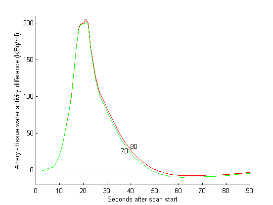
Here is a plot of the difference between blood and brain radioactivity concentration for the 80 and the 70 ml/100mls/min areas:

While the artery has a higher concentration, fast blood flow will lead to faster influx of radioactivity. However, when the artery has a lower concentration than the brain, as it does after ~50 seconds of the scan, higher blood flow will cause the brain, with its higher radioactivity, to increase its loss of activity by diffusion back into the bloodstream. As you can see from the graph, this negative, or 'washout' effect is much smaller than the positive effect during the first period of the scan (here from ~8 to 50 seconds). Despite this, the evidence suggests that this washout effect does seem to have a measurable effect on the signal (see references below).
Thus, in order to make the difference between activated and not activated areas as great as possible, we should try and ensure that:
- activation occurs during the early phase, when the brain concentration is lower than the blood
- activation does not occur during the late phase, when the brain has a higher concentration than the blood.
When does the late phase start? It starts about 10 seconds or so after the tissue curves have stopped rising. The tissue curves are similar to the headcurve; therefore you can plan to restrict your activation to the period of the rise in the headcurve, and shortly after, in order to prevent washout, and increase your contrast.
Here are some references:
 Silbersweig DA, Stern E, Frith CD, Cahill C, Schnorr L, Grootoonk S, Spinks T, Clark J, Frackowiak RSJ, Jones T. Detection of thirty-second cognitive activations in single subjects with positron emission tomography: a new low-dose H215O regional cerebral blood flow three-dimensional imaging technique. J Cereb Blood Flow Metab 1993 13:617-629
Silbersweig et al showed that activation for 30 seconds, during the rising phase of the headcurve only, was effective in generating PET activation, but that activation after the rising phase of the headcurve was ineffective, as expected.
 Silbersweig DA, Stern E, Schnorr L, Frith CD, Ashburner J, Frackowiak RSJ, Jones T. Imaging transient, randomly occurring neuropsychological events in single subjects with positron emission tomography: an event related count rate correlational analysis. J Cereb Blood Flow Metab 1994 14:771-782
The same group showed that it was possible to generate a measure of the PET activation signal, by looking at the timing of each pulse of activation relative to the headcurve. Their measure of the amount of signal change, for a given activation pulse, was (more or less) the area under the difference curve (second figure) for the period of the activation. In other words, the amount of signal change, for a given activation, is related directly to the timing of the activation relative to the artery-tissue difference.
 Cherry SR, Woods RP, Doshi NK, Banerjee PK, Mazziotta JC. Improved signal to noise in PET activation studies using switched paradigms. J Nucl Med 1995 36(2): 307-314
This group did a clever crossover experiment where they had their subjects perform condition A as the headcurve was rising (and the arterial / tissue difference was positive), then switched to condition B during the washout phase of the scan. They compared this with a B then A during washout condition, and were able to show better contrast than for (continuous A versus continuous B), suggesting that the washout effect may be of importance in changing PET signal. In fact they found 20%-30% signal to noise improvement by using the switched paradigm.
To get a feel for some real headcurve timings, have a look at: Example timings of headcurve rises and peaks in 12 scans
With many thanks to Vin Cunningham (MRC Cyclotron unit) for much helpful advice, and data for the plots
Matthew Brett
